
ABOUT THE PROJECT
Product Design for iOS
My Roles: Project Management, UX Research, Wireframing, Prototyping
Date: February 2023 | 4 Week Design Sprint
In collaboration with Jessica Bellamy and Phillip Ornelaz
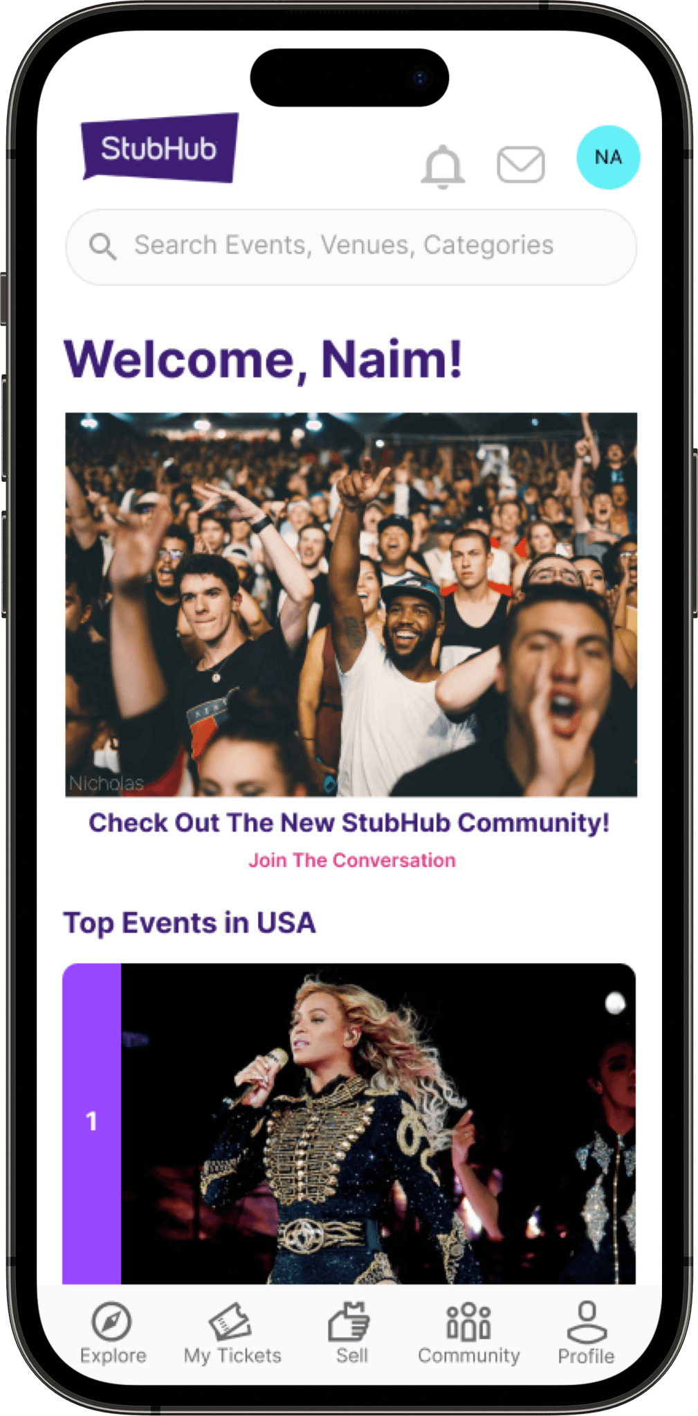

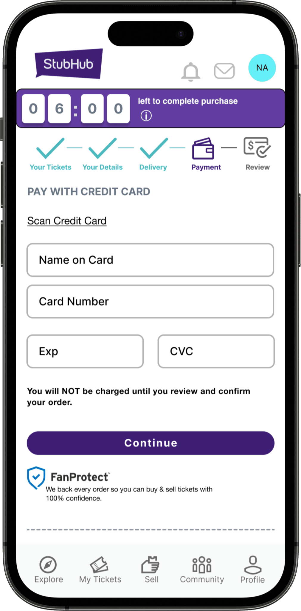


UI Samples of Final Product
Background
For this project, the design team was tasked with the challenge of enticing new and returning customers to the ticket resale platform, StubHub. We analyzed the current purchase flow, and ideated solutions on how to refresh the experience, and incentivize continued return to the app. We first began by analyzing StubHub’s current mobile state.
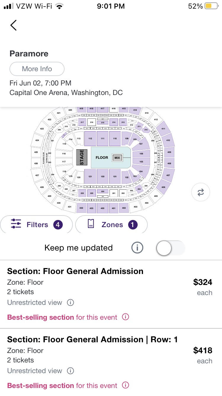
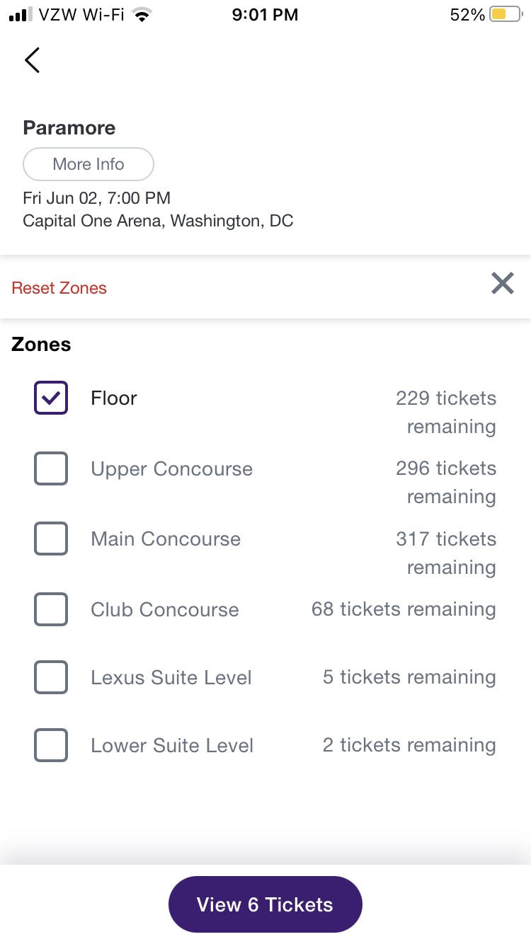


Current State of StubHub Ticket Purchase Flow (February 2023)
StubHub Community: a design opportunity
Through the current state analysis and competitive research, a compelling opportunity emerged in the StubHub Community Customer Support Forums.

3rd Party Competitve Analysis
Source: https://techboomers.com/learn/selling-on-ticketmaster-vs-stubhub#stubhub-vs-ticketmaster-differences
Where Ticketmaster relies on an AI chatbot Virtual Assistant for immediate customer needs, StubHub uniquely offers a more peer-to-peer touch to customer support. This offering inspired our design solution to revamp the StubHub Community as a way of connecting users to each other.
The Ah-ha moment:
What better way to build trust in the second-hand market place, than to lean in to the peer-to-peer community exchange?


State of StubHub Community mobile experience (February 2023)
Currently, StubHub Community is not native to the mobile app and redirects the user to their mobile browser.
User research and Personas
After conducting user interviews assessing users’ impressions of StubHub’s purchase flow and community forums, key insights emerged as expressed in the following “I” statements:
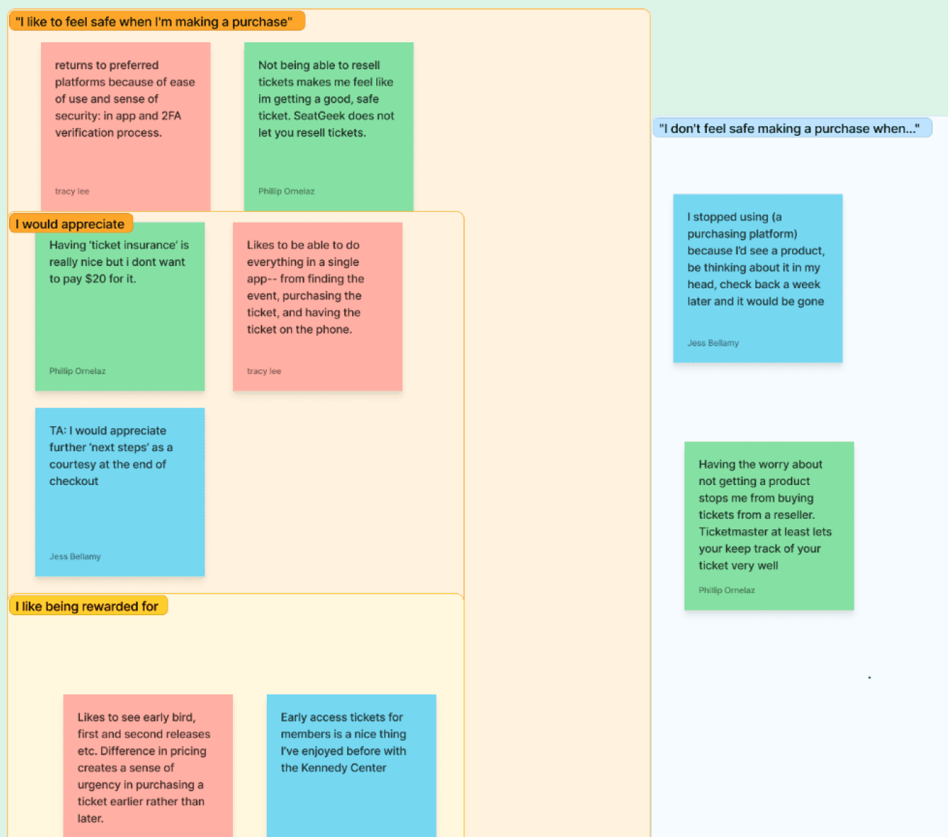
Sample of affinity mapping user interview notes

I like knowing my path.
I don’t need all of this information in my purchase flow.
I need to feel safe when making a purchase.
I seek human interaction.
I like being rewarded.
Research findings were synthesized into the following personas:


Liv January aka The Convert, is our new user; Naim Abdur aka The Revert, is our long-lost, but returning user.
Problem
Liv and Naim enjoy live events, but struggle with the trustworthiness of the second-hand marketplace. They need an active community for the ticket marketplace that is both functional and social so that they can confidently attend and share event experiences with other users.
How might we make Naim and Live feel like they are part of a trustworthy community?
How might we reward Liv and other expert users to ensure their return to StubHub?
How might we provide Naim and Liv with a seamless and stress-free ticket-purchasing experience?
Solution
Foster Trust
Convert current web community feature to native app and deploy.
Update User Agreement to allow peer-to-peer ticket purchasing.
Tidy up
Condense purchasing system to show immediate next steps at top of screen and previous steps accessible from accordion menus.
Goodbye back button! Replace back button with sticky navigation bars on top and bottom of screen.
Ensure transfers are safe and secure
Implement Two-factor authentication for security and to expedite ticket transfer process for expert users.
Make It Nice
CTA buttons to encourage users to engage in the community.
Provide directions and parking info as courtesy followup after purchase.
ideation
After conducting some extremely generative design studios, our team brought our collaborative magic to life. I took Jessica’s sketches, and created mid-fidelity wireframes from which a high fidelity prototype was built.
Mid-Fidelity Wireframes: Liv’s Community Flow


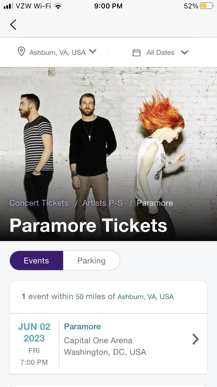
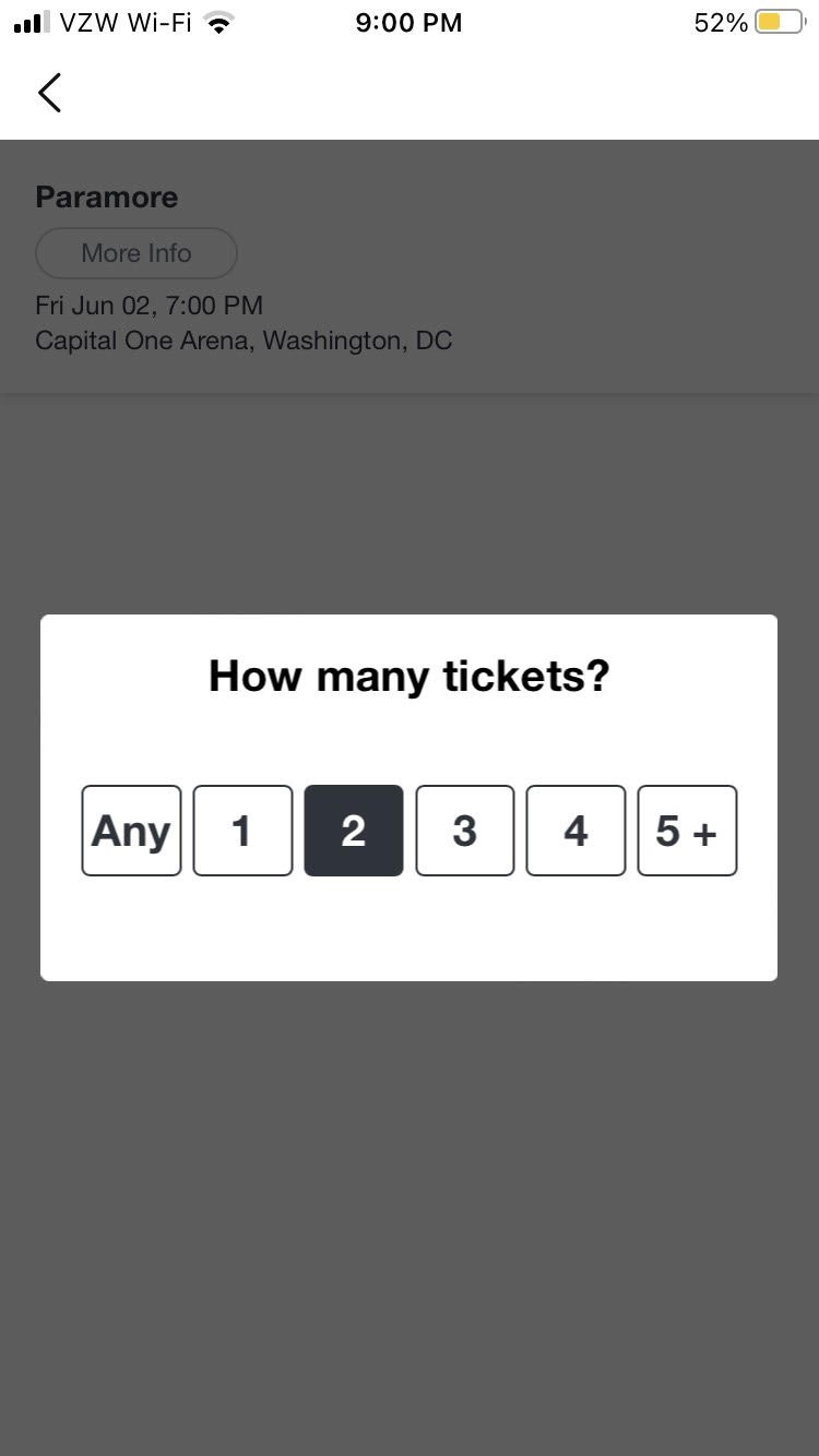
Mid-Fidelity Wireframes: Naim’s Checkout Flow


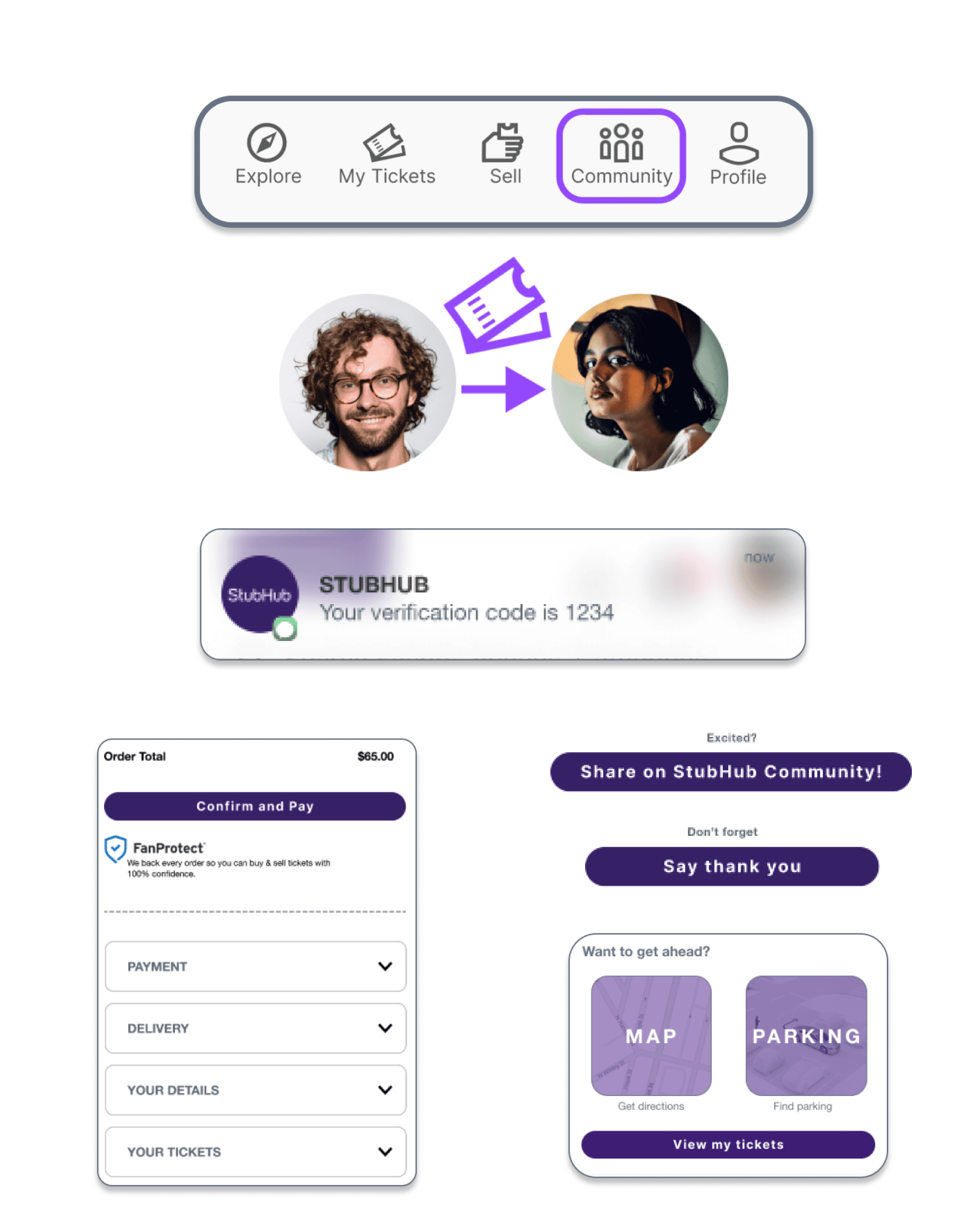
Final Product
Prototype videos: (a) Liv’s Community Flow, (b) Naim’s Checkout Flow
Testing & Next Steps
Design System: Light and Dark CTA Buttons
Usability testing of the StubHub Community indicated that users understood and enjoyed the product concept and experience. Users found the buttons on the homepage difficult to see, so our next steps would include the addition of light and dark CTA buttons to the StubHub design system for higher contrast options.

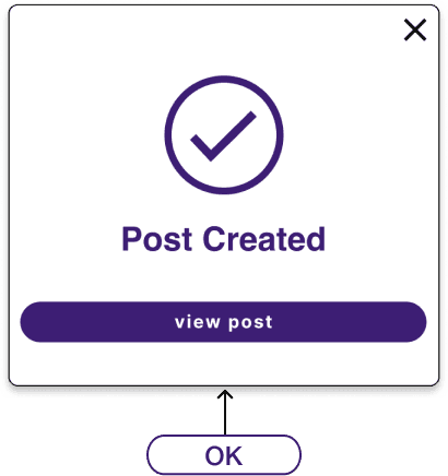
Affirmative Language
An ESL user generously offered the insight that clicking “x” to close the post confirmation overlay felt “negative and awkward.” He preferred an “OK” as a more affirmative experience.
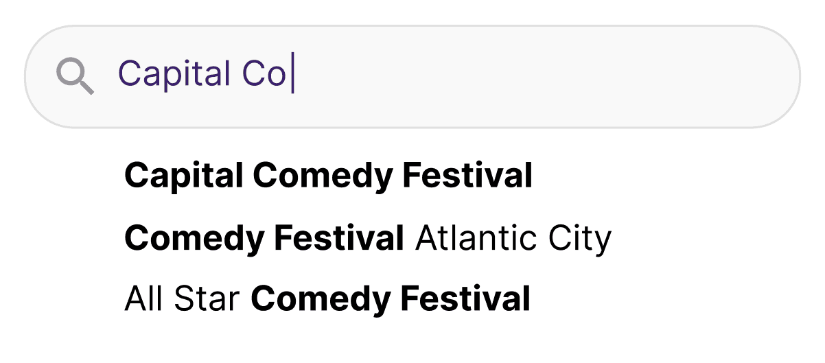
Search and Home Screen: Recognition vs. Recall
In Naim’s checkout flow, 4/5 users did not reach the search screen. They instead scrolled to the comedy section of the homepage to find the Capital Comedy Festival, indicating that homepage content is highly influential in dictating the path from which users will begin their experience.
Clear Demarcation of Current vs Completed Steps
Users indicated that the accordian boxes were confusing. After realizing these were completed steps, one user indicated that the demarcation needed to be a solid line to clearly distinguish completed tasks vs current tasks in the checkout flow.

