
ABOUT THE PROJECT
UX/UI Design, Content Strategy, Project Management
Client: Postal Petals | Product Design for Web
My Roles: Project Management, Lead UI Designer and Content Strategist
Date: March-April 2023 | 6 Week Design Sprint
In collaboration with Brook Schales, Saige Rodriguez and Daniel Brown


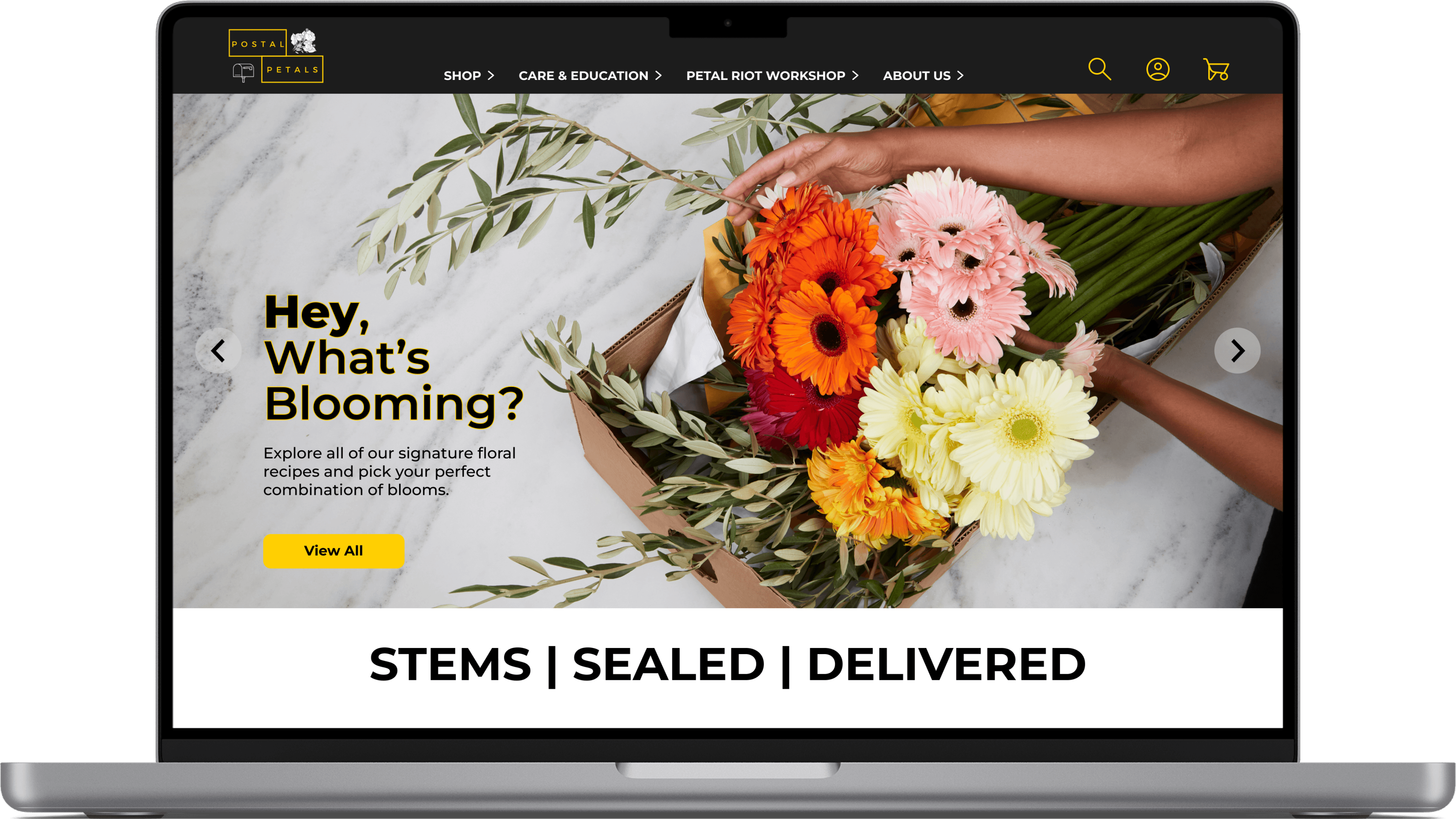
UI Samples of Final Product
Background
Postal Petals wants to disrupt the floral industry, as we know it. They are an immersive wellness startup, promoting gender agnostic self-care by selling DIY floral arrangement kits, and offering educational resources including virtual workshops and live arrangement events. Their goal was to see how they could improve the current web and E-Commerce experience for both new and current customers so they can better adapt their product.
Problem
Postal Petals customers are attracted to supporting a Black, woman-owned business to purchase DIY flower arranging kits as a form of immersive wellness, but the confusing navigation and lack of visual cohesion are causing distrust and purchase abandonment. Customers need clarity throughout their experience to make confident purchases, book workshops and take advantage of Postal Petals unique educational offerings.

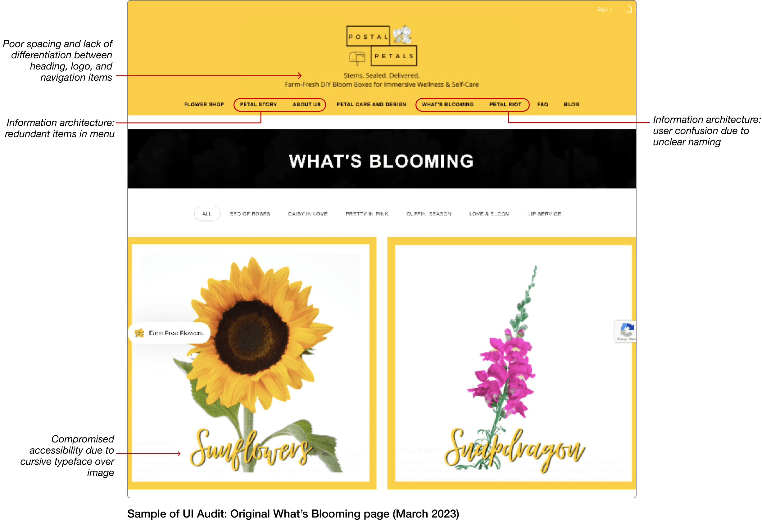
Original Postal Petals website (March 2023)
my role & our design goals
Teamwork makes the dream work: Our team worked very collaboratively throughout the entire project. While we all had a hand in every aspect of the design process, I co-led UI Design and Content Strategy.
After conducting an initial heuristic evaluation, the design team found many opportunities to improve upon Postal Petals web experience. It was clear that the content and product had integrity, however the presentation of the product was not doing justice to their product.
By leveraging Postal Petals’ existing content and distinct brand identity, our team aimed to elevate the brand’s unique voice and improve the user’s experience and understanding of the website and Postal Petals product.
Research
User Personas
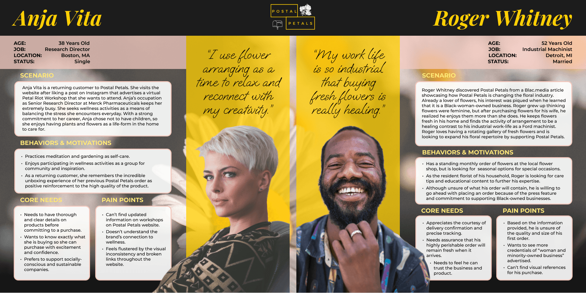
Two personas: Anja Vita and Roger Whitney
Key User Frustrations
The Language: Users were intrigued by the “Petal Riot,” but had no idea what it was even after clicking the link to learn more. Although the language is unique and creative, users sought clarity and guidance throughout their purchasing journey.
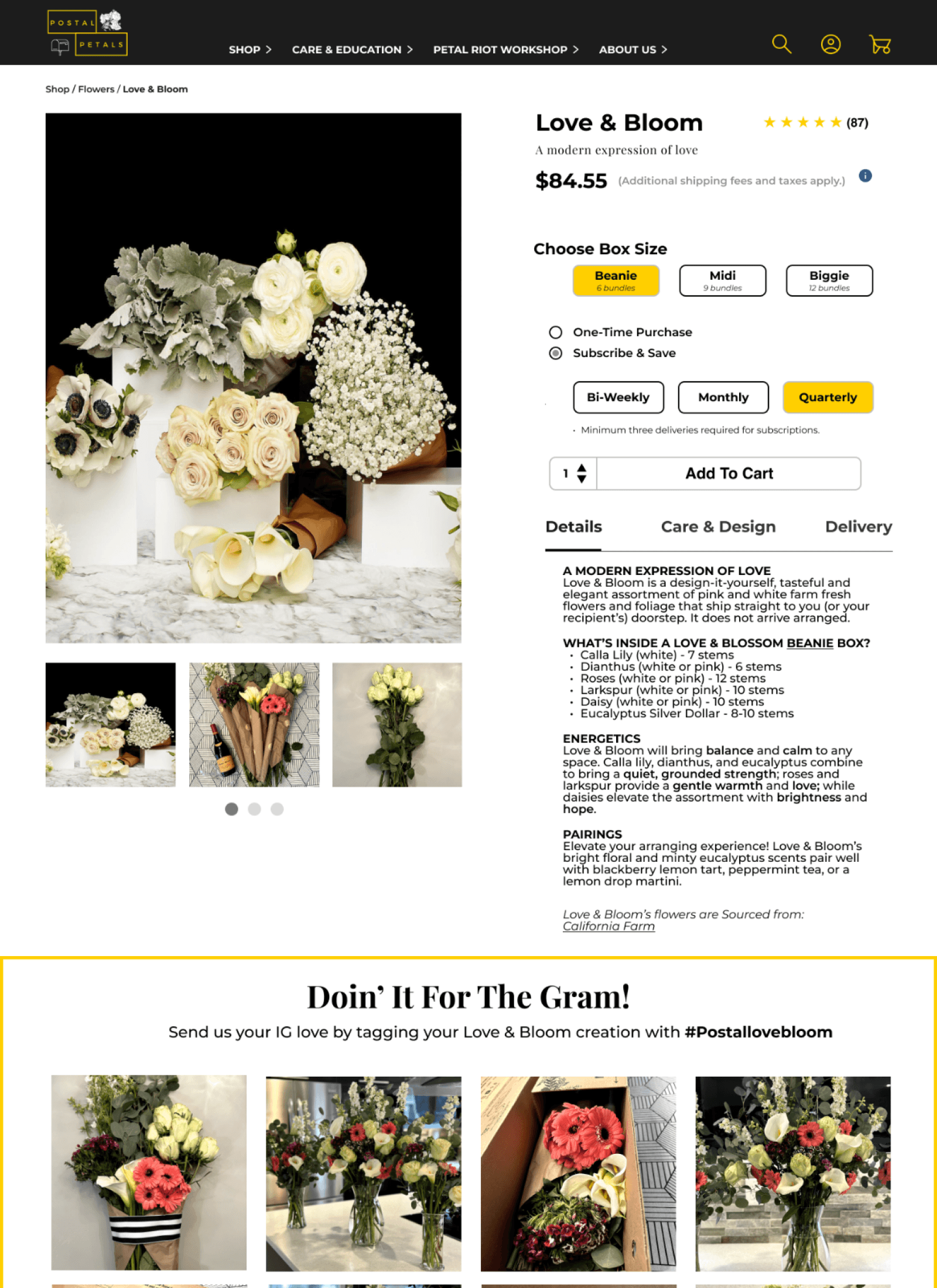
The Product: Users wanted to see images of the product they were purchasing. They wanted to have a clear understanding of the scale and contents of their purchase.
Information Architecture

Proposed navigation menu restructure
First things first: Navigation!
In response to user confusion, we began by addressing the issue of navigation. After conducting a card sort, we reorganized global navigation by consolidating redundant menu items and providing context to the creative names. For example, several users in interviews and card sort responses expressed curiosity and confusion at the “Petal Riot,” in particular, so we proposed “Petal Riot Workshops” for clarity, while maintaining Postal Petals’ distinct branding accent.

New navigation menu with updated UI (collapsed)

New navigation menu with updated UI (open)
Ui Design, Visual Design & Content Strategy
Make It Usable & Maintain the Vibe
With respect to the existing aesthetic, the style guide was updated to create visual cohesion throughout the web experience. Most significant changes occurred in reducing the site’s prominence of its’ signature yellow to an accent. Additionally, the variety of typefaces was reduced to only two: Playfair Display and Montserrat.
Strategy: Using UI and Visual Design to Elevate Brand Identity
Uniting the goals of the company with the needs of the user presented as one of the more nuanced and exciting challenges of this project. As content strategist, I found it important to highlight the traits that made Postal Petals unique. I kept a few questions in mind to guide the design process, doing justice to Postal Petals distinct vision while delivering a coherent user experience:

How might we help the user understand the connection between flowers and wellness?
How might we empower the user throughout their purchase flow to feel proud of the business they are supporting?
How might we present flower arranging to be inclusive of all gender expressions?
Roger & Anja
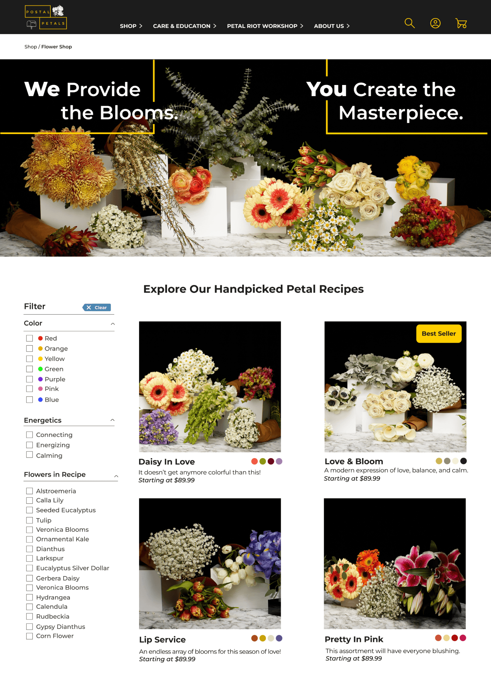
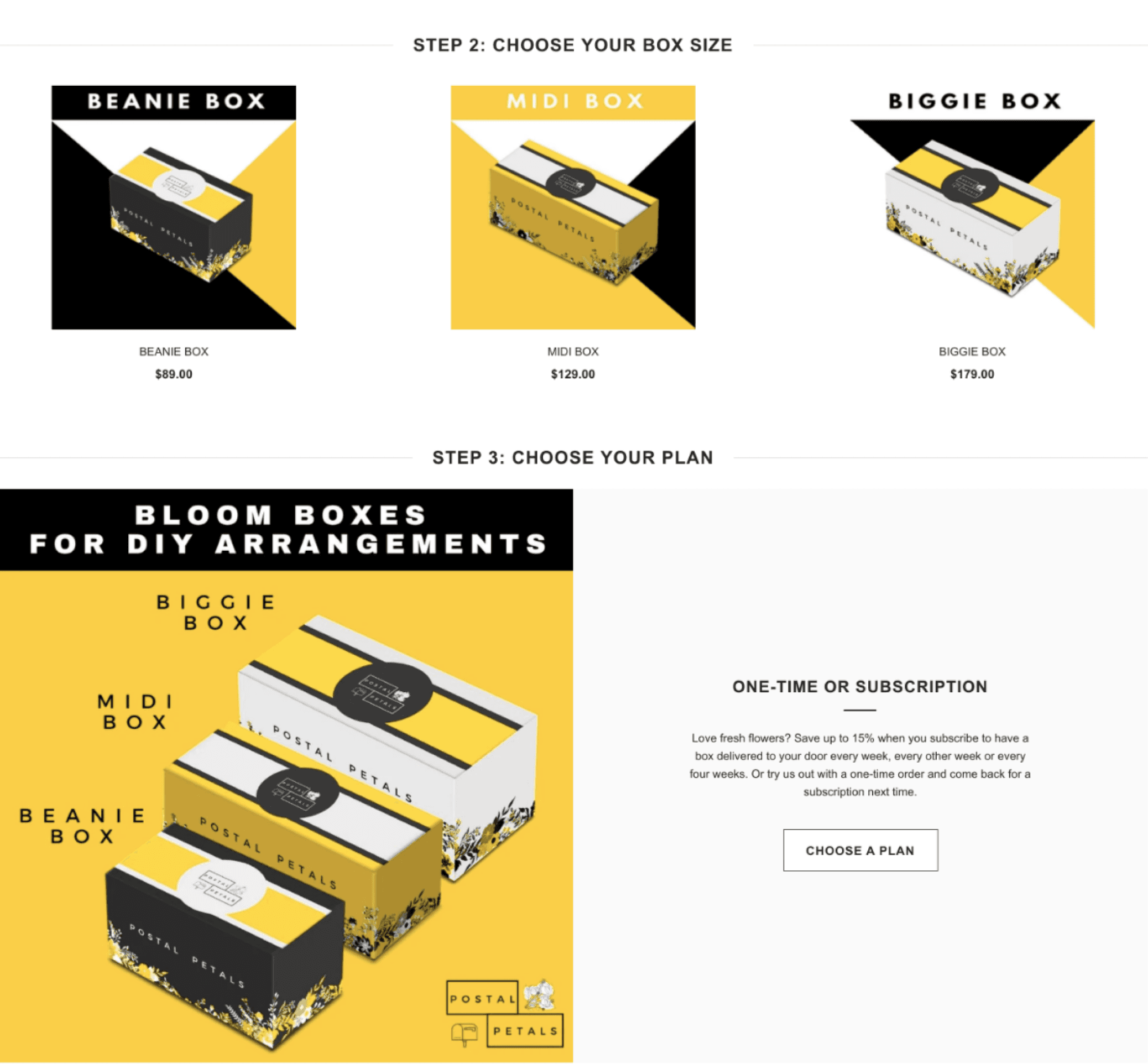
Roger’s Wire Flows: Recurring Subscription through What’s Blooming or Flower Shop
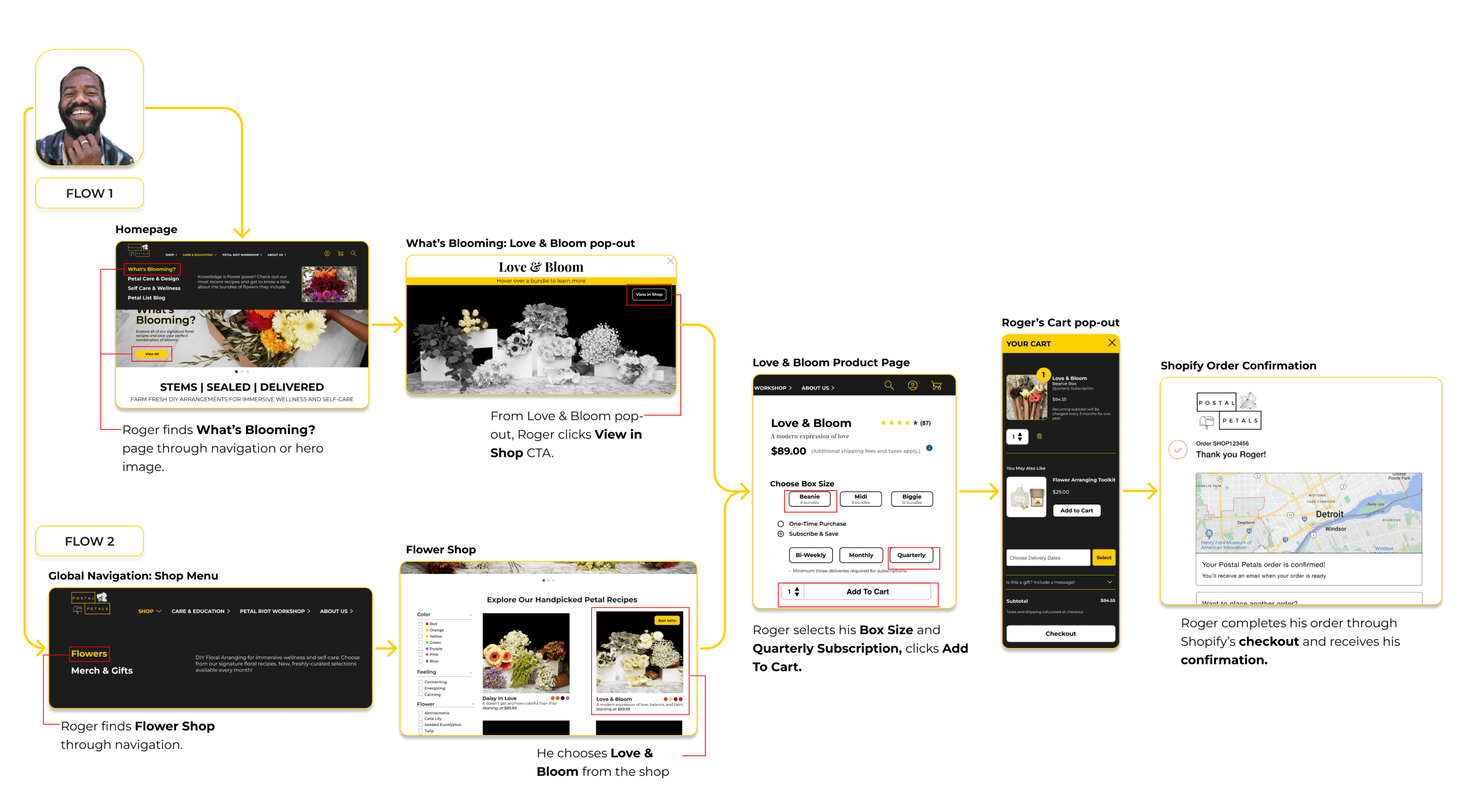
As a new customer, Roger is interested in learning about flowers that are in season, and starting a quarterly flower box subscription. We set two paths for him to take: One through the educational page called “What’s Blooming,” and the other simply goes through the Flower Shop.
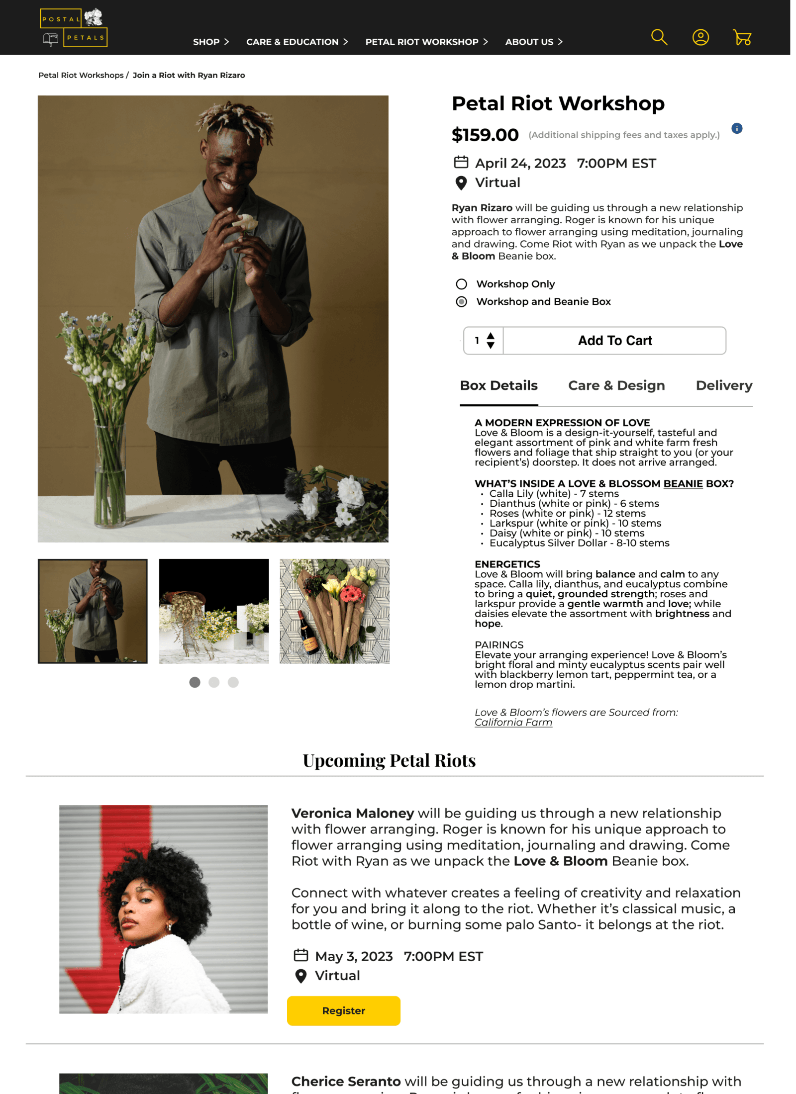
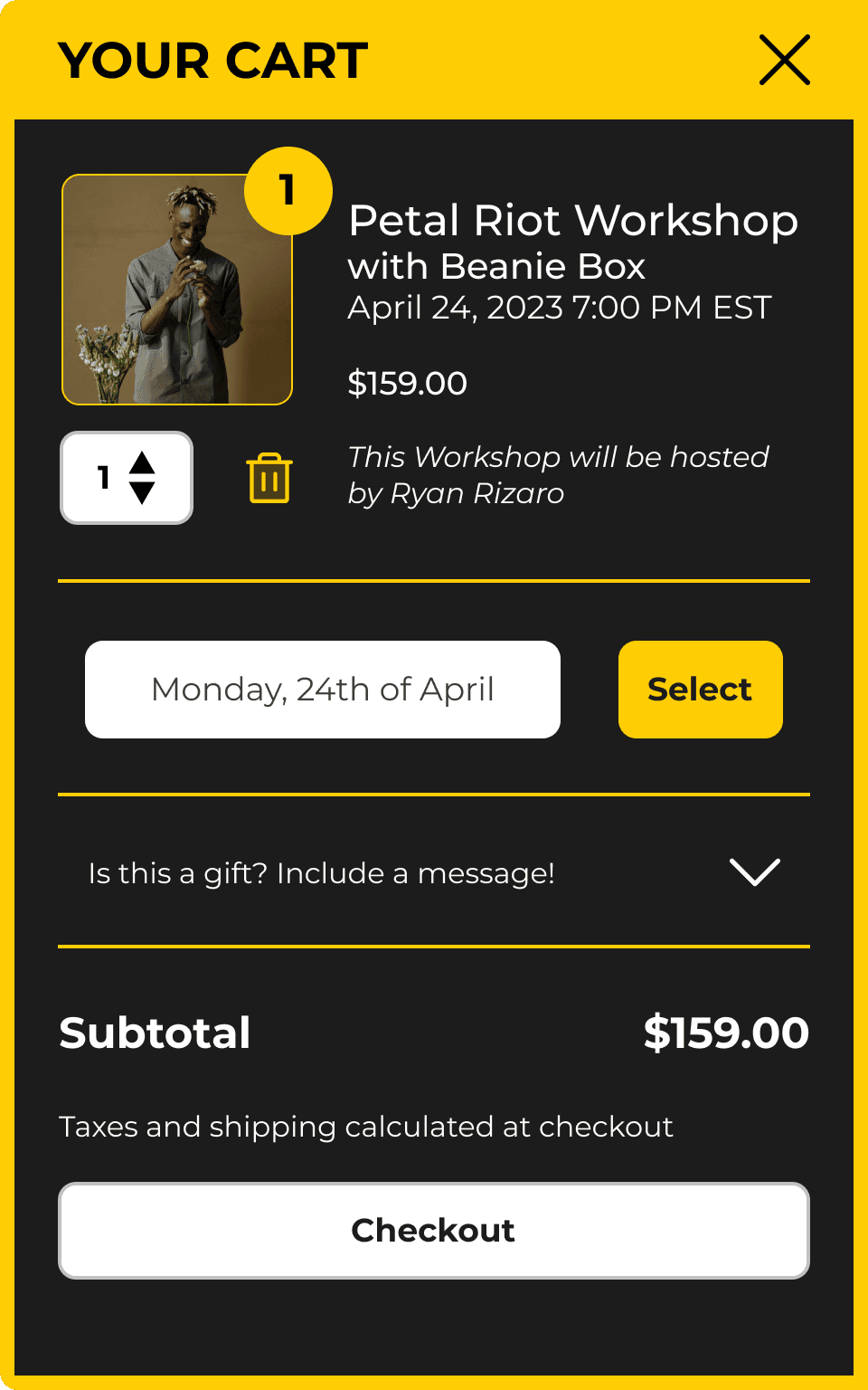
Anja’s Wire Flow: Petal Riot Workshop and Checkout

As a returning customer, Anja is interested in booking a virtual workshop and purchasing the corresponding flower box.
Final Product
Impact
Participants in usability testing reported the following:
The site is intuitive and easy to navigate.
The colors, layout, and photos on the site are visually appealing.
Return users found the site to have happy, fun, and uplifting vibes.
Return users reported that their understanding of the products as well as the flow and navigation of the site had improved.
One person purchased a Beanie Box from postalpetals.com after viewing our presentation.
